HomeView: 5 weird decisions on Apple’s new smart screen
It’s finally here.
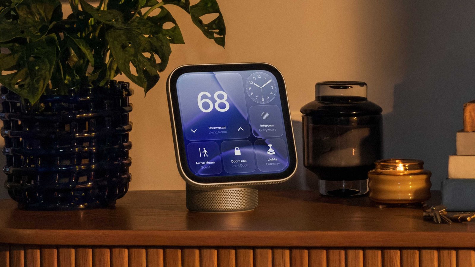
After months of leaks and rumours, Apple’s first-ever dedicated smart home display. The HomeView (I still think ‘HomePad’ is a better name) is designed to be a one-stop shop for home life, with built-in Siri AI, extensive smart home management and dedicated entertainment apps.
It makes a lot of sense in principle, and fills a glaring hole in Apple’s smart home lineup, allowing it to directly compete with Amazon’s Echo Show line.
However, for every great decision Apple has made on the HomeView, there’s another that feels equally baffling. Here are the five strangest things about it that struck me immediately.
It’s hip to be square – until it isn’t
Until now, basically every smart display has agreed on the same rough form factor: a rectangle. It matches tablet and laptop screens, making it useful for displaying key information and consuming content – it’s the best of both worlds.
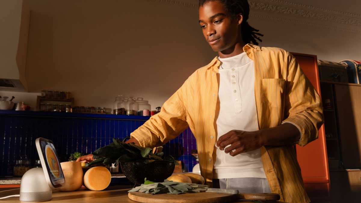
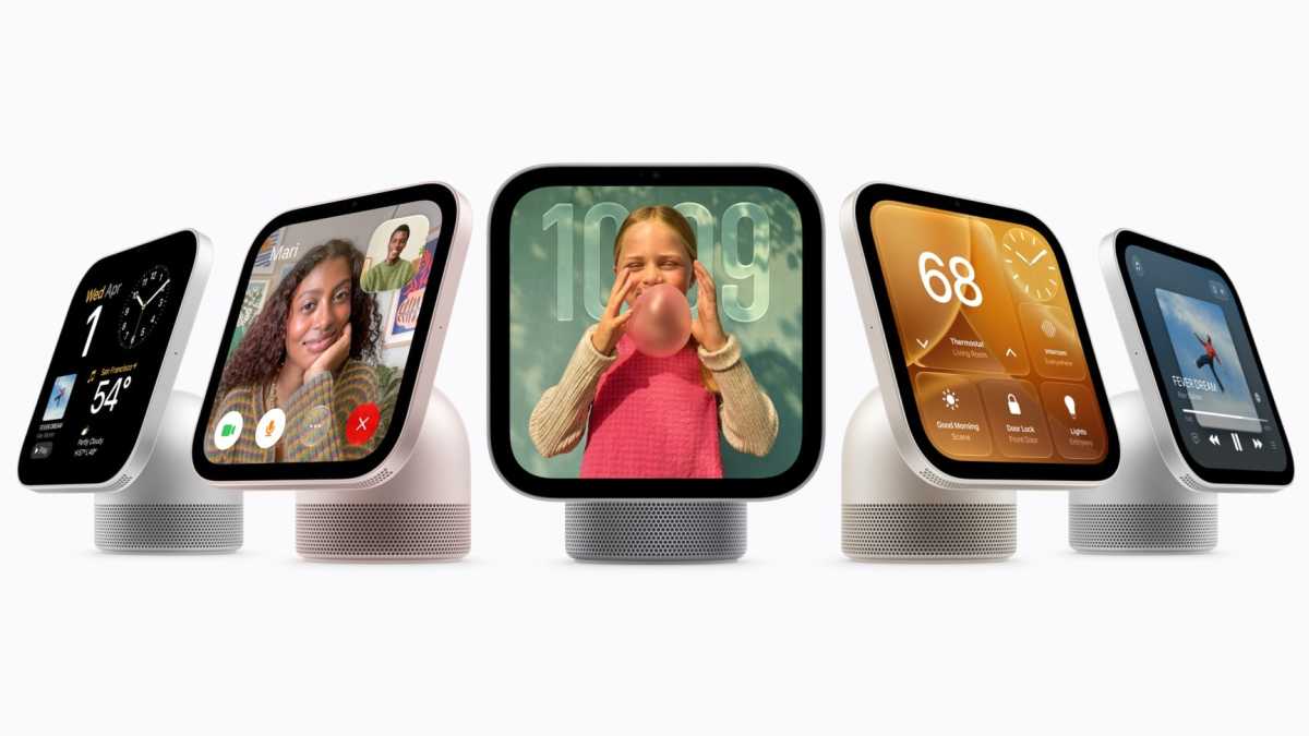
But for some reason, Apple has decided it wants to be different. The HomeView has a rounded square design that makes it look just like a massive Apple Watch. From a pure looks perspective, the symmetry is gorgeous, but it feels like a compromise every time you actually want to do something.
Apple
In a group FaceTime call? Someone will probably be squashed in awkwardly. Following a recipe? Be prepared for a lot of scrolling. Viewing literally any kind of video? It’s a straight choice between cropped or heavily distorted content. Unless Apple has performed miracles, the user experience on the HomeView will almost certainly be worse than a traditional wide screen.
Also, while I praised Apple for the HomeView’s premium, symmetrical aesthetic, that doesn’t extend to the colour selection.
You can choose between Silver, Starlight, Rose Pink and Space Grey. All sleek and sophisticated, but nothing that will really make a statement in your home. It reminds me of a MacBook colour selection, and not in a good way. Boring!
History repeating itself?
Many people will remember that when the iPhone first launched in 2007, there were no third-party apps. To use it, you were entirely reliant on Apple’s own apps, with the App Store not launched until a year later.
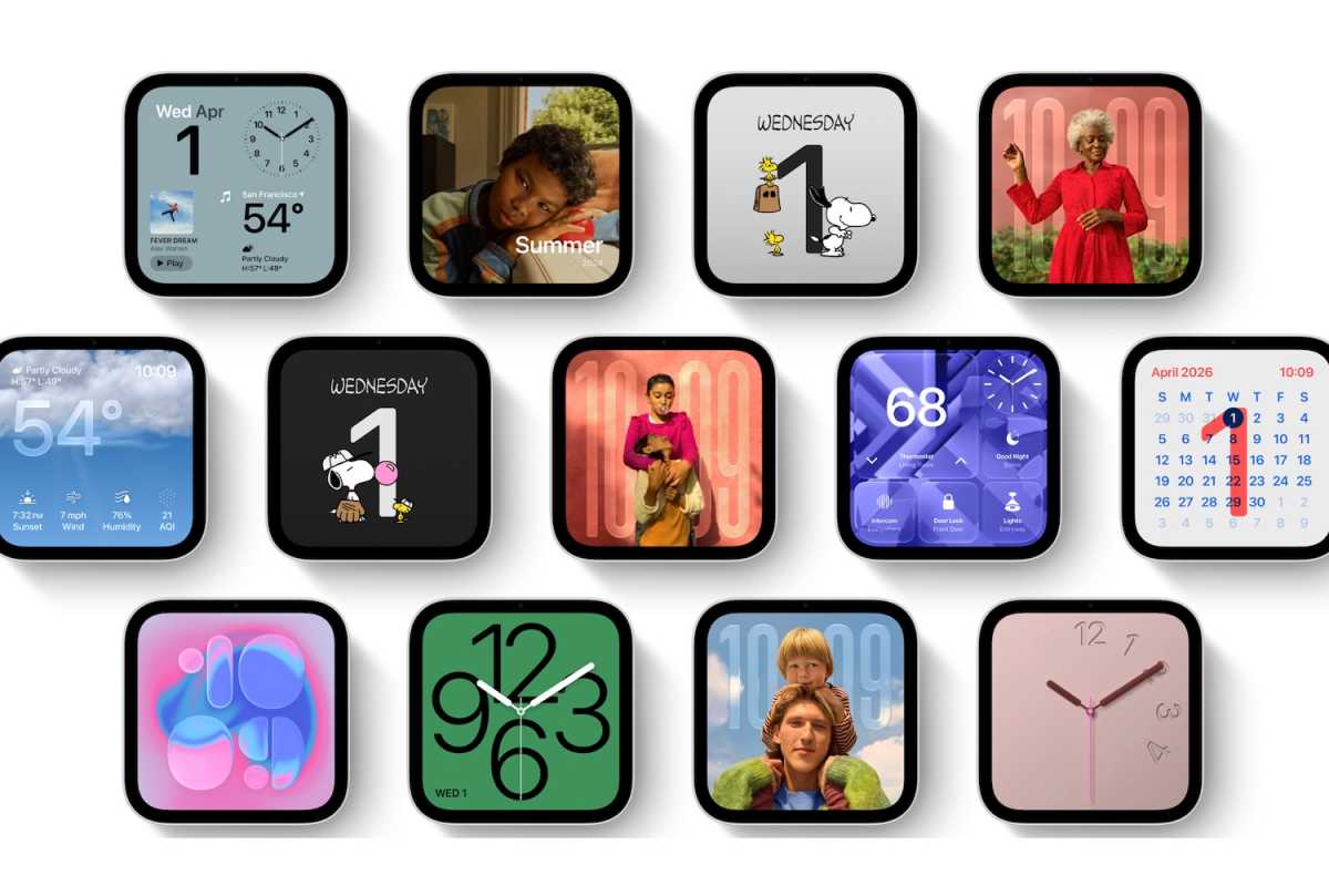
While less crucial on a smart display, Apple has, for some reason, followed the same blueprint on the HomeView. Aside from a handful of exceptions (such as Spotify and Audible), basically no third-party apps are supported.
Apple
If you wanted to use it for YouTube or Netflix (given the square screen, why would you?), it’s impossible right now. But there are dozens of great third-party apps which simply aren’t available on the HomeView at launch.
Is Apple waiting for developers to catch up and optimise their apps for the unusual aspect ratio? I really hope so, because the selection at launch is very disappointing.
Incredibly restrictive compatibility
Android users are completely locked out of the HomePod – it requires an iPhone for setup.
While that’s hardly surprising, Apple is massively limiting which iPhone models will get the full functionality. To access the most useful features, such as reading text messages from your phone or checking your calendar, you must have an iPhone 15 Pro or later.
Apple
Essentially, it means anyone whose phone is more than three years old shouldn’t bother getting one. With most iPhones supported for more than double that, it means a significant chunk of potential HomeView buyers will have to upgrade or miss out.
A “blind” camera
One of the great things about Amazon and Google’s camera-equipped smart speaker is that they can double as a home security camera. If you want to check on a pet, monitor for a potential emergency or just check everything is looking as it should, you can do so with a couple of taps.
Not so on the HomeView. Despite having a very capable 12Mp, f/2.4 sensor, Apple is blocking you from using it for anything other than facial and movement recognition, distance awareness and FaceTime calls.
Instead, Apple wants you to pair it with one of its new separate ‘Home Collection’ accessories (shown below), which have been designed in collaboration with LG and Schneider Electric. Of course.
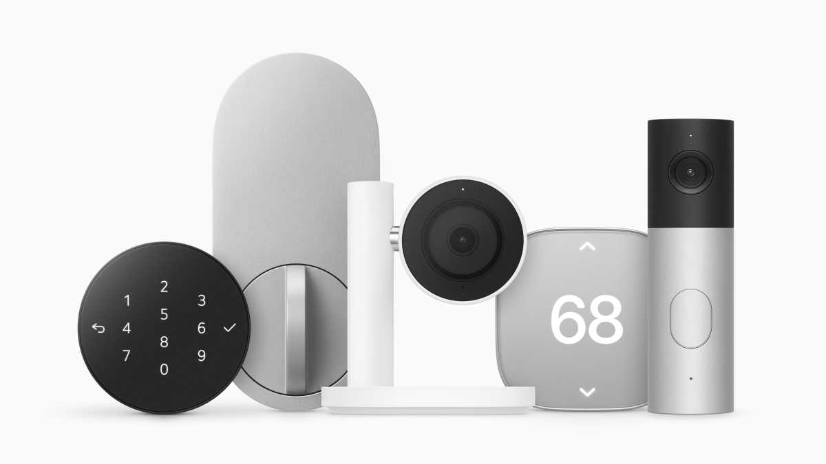
Apple
Ultimately, Apple is preventing you from using the HomeView’s camera to its full potential, which will always be frustrating.
A mount-ain of price problems
Was anyone expecting the HomeView to be cheap? I certainly wasn’t, but a £299/$299 price tag means it costs as much as the most expensive budget phone. I know which one I’d rather have.
That price will get you the HomeView on its stand, which is designed to be placed on a table or kitchen counter. But what if you want to mount it on a wall?
On the surface, the ‘Wall-Mounted’ version costs the exact same £299/$299. But dig a little deeper, and you’ll realise that it literally won’t function unless you combine it with a supported mount and power supply.
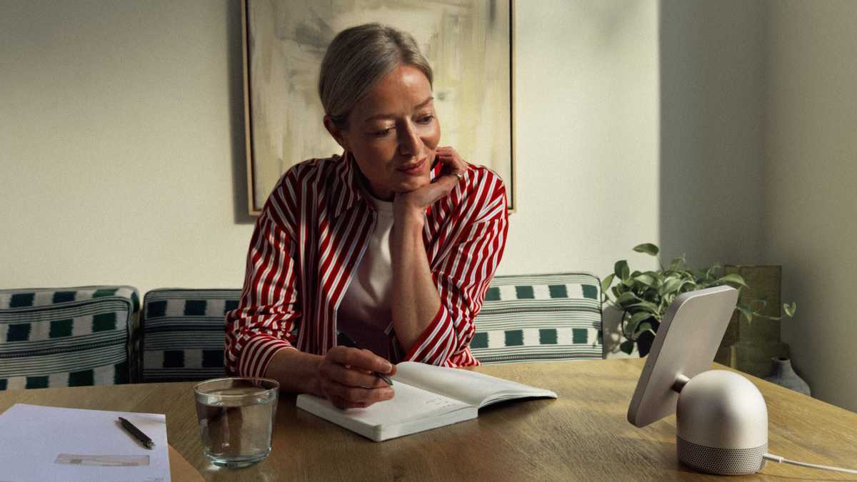
Apple
These cost £54.95/$59.95 for a USB-C version, or £69.99/$79.95 for one with a dedicated AC power source. All of a sudden, you’re paying in excess of £350/$350 for the privilege of putting it on your wall.
Even without the mount, the HomeView is a tough sell. Apple needed to fill this gap in its smart home lineup, but the HomeView has some pretty glaring issues on paper.
Pre-orders are live now via the Apple UK and Apple US sites, ahead of the HomeView’s release on 13 November.