Downloading the reference photograph
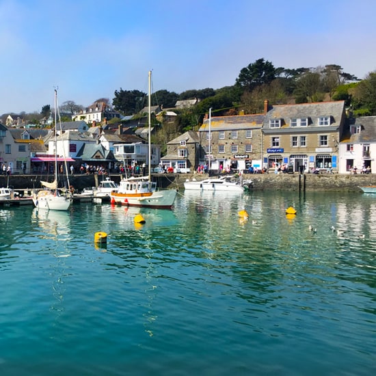
The photo below can be ‘right clicked’ and ‘Save image as’, so you can use it as a reference image, print it out and follow along with the video above.
You can also download a High-Resolution Image here...
Materials you will need:
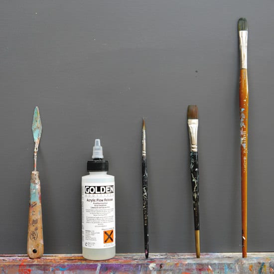
Palette Knife
- Medium size, Diamond-shaped, cranked (angled) handle. I usually use an RGM 45. I don’t paint with the palette knife in this tutorial; I just use it for putting out the paint.
Brushes
- 1/2 inch Flat brush (I say 1/4 inch at the beginning of the video, but it’s actually a 1/2 inch) The brand I demonstrate with is a Synthetic Proarte Prolene series 106. It’s designed as a watercolour brush, so it works well for these initial wash like layers.
- Small round brush – Rosemary & co Series 344 size 4
- Medium filbert – Isabey Isacryl Filbert Series 6572 size 6
Support
- 12 x 12 inch (30 x 30 cm) canvas that has 2 coats of white acrylic gesso applied.
- Kitchen roll/paper towel
- Clean water
- Tear-off palette or stay-wet palette (I demonstrate on a tear-off palette)
Paints – The colour palette
Artist quality acrylic colours (I’ve used a mix of Golden Heavy Body colours & Winsor & Newton Artist Acrylic)
- Titanium white
- Naples Yellow
- Raw Umber
- Phthalo Blue (Green shade) – a cool blue such as Cerulean Blue would also work.
- Cadmium yellow light – or any Cadmium/bright yellow
- Alizarin crimson permanent (Winsor & Newton) – a Cadmium red would also work.
- Ultramarine blue
Mediums
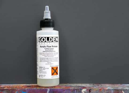
Acrylic Flow Release – Golden Paints – not essential but can be handy for adding staining effects when working in thin layers on a surface that is repelling the water. It is convenient on pre-primed canvas boards, which often have a very shiny surface applied in the manufacturing process.
Step 1. – Drawing out
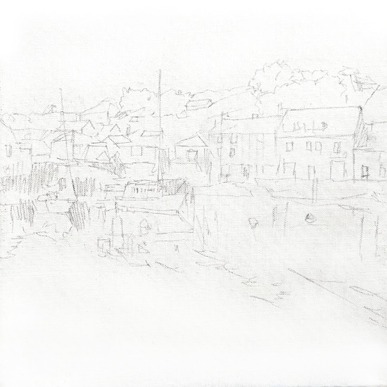
I’ve drawn out a rough sketch directly onto the white canvas. Usually, I work on top of a coloured ground but wanted to show how I would approach adding colour to certain areas of the painting on top of a white canvas. The sketch can be done with an HB, 2B or 3B pencil, depending on how the graphite goes down onto your painting surface. Don’t go too heavy with the drawing because the graphite will mix in with the watery paint in the next stage of the painting.
I want the focus to be on the white boat in the centre, so it’s a great subject to keep white and keep that luminosity from the white gesso ground showing through.
Step 2. – Blocking in the Yellow tones.
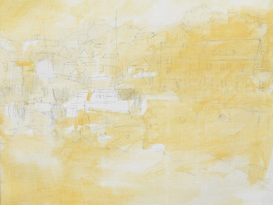
I start with a Naples Yellow.
Naples Yellow has got this lovely warm quality to it and works especially well as the basis for paintings of sand or blue-based seascapes. It’s often labelled as ‘Naples Yellow Hue’ as the modern paint is a non-toxic version of the original lead-based paint. It’s made of synthetic iron oxide pre-mixed with Titanium White.
Pro tip: Naples Yellow can also be a fantastic colour for portrait painting if you’re finding yellow ochre a bit too strong. If you don’t have Naples Yellow, you can mix a very similar colour by using Yellow Ochre mixed with white.
For the first stages of the Harbour painting, I’m just looking for an underlying yellow hue to the picture. Then I can vary the paint’s consistency to a subtle or more intense area of your choice. For example, the houses on the right can take an opaque covering of Naples Yellow, whereas the sky on the left would be better having a light covering because it’ll eventually become quite a warm blue.
I’ve added a few drops of acrylic flow release to the water; this helps to disperse the surface tension and give the paint more of a staining effect. You don’t have to use it, but it can work well if your canvas surface is repelling the water. Be careful not to over mix it in the water because it can easily foam.
Step 3. – Adding Raw Umber
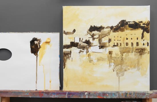
For establishing the darkest darks, I’m using a Raw Umber. This has a cooler, greener tone than Burnt Umber, so it works really well with general cool blues in the painting.
I again change the consistency of the paint with the water, and I’m using the half-inch square-edged flat brush.
Using the flat square brush is very handy for drawing and painting buildings and a good way to practice brush skills because you can draw thin lines and sharp edges of buildings.
Step 4. – Adding White

I now introduce a Titanium White, which helps to mix some lovely greys between the Naples Yellow and Raw Umber. This works well for shadows in white buildings in sunlight because it still has that nice warmth.
This stage of the painting can start to feel slightly sombre and muted, but it’s easier to put in these subtle tones now and then creep up on the brighter colours. If you can resist going for the vivid colours, in the beginning, your painting will come together really easily in the next few steps.
Step 5. – Adding Phthalo Blue
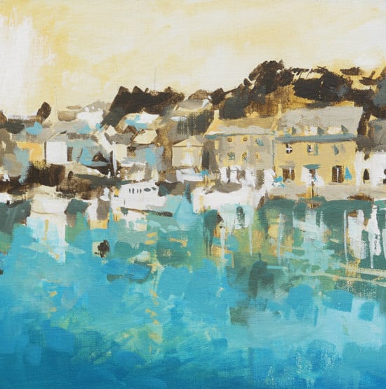
Once we’ve got the tones working in the middle of the painting, we can start to go in with some bright blue. Phthalo Blue (Green Shade) is such a great colour for creating powerful green blues. It’s a strong pigment, so you have to be very careful when mixing with other colours because it can easily overwhelm your mixes, but for creating a Turquoise blue, it’s fantastic.
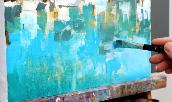
I start to wash in the colour just diluted with the water, and you’ll notice how the optical effect of the blue over the Naples Yellow gives a nice green effect on the sea.
I’m keeping the bottom of the painting a cool green-blue so it will contrast with a warmer blue in the sky.
Step 6. – Adding a glaze to the sky.
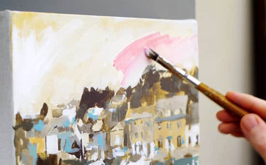
The right-hand side of the sky has got this lovely warm red undertone to it. By applying a thin glaze of Alizarin Crimson Permanent, it gives a nice transparent stain of colour.
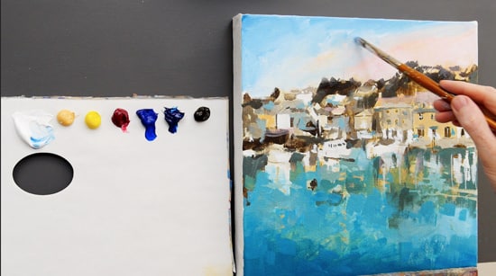
I can then work over the top using a mix of Ultramarine Blue and Titanium White. I want to keep the sky smooth and clean in comparison to the more painterly foreground. I’ve also swapped to a number 6 Isabey Isacryl Filbert brush for a more ‘scrubby’ technique to the sky.
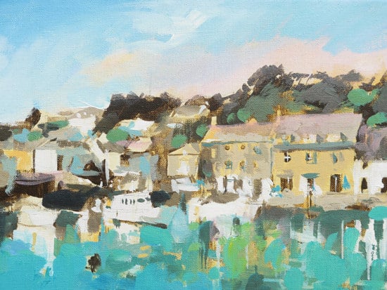
Step 7. – Adding brighter pigments.
Using a Cadmium Yellow Light mixed with the Phthalo Blue, I can add some brighter, greener blues into the water and add some greens to the background trees.
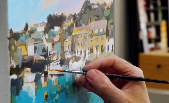
Swapping back to the finer round brush, I now add details to the boats and buildings, painting more vibrant yellows, oranges and reds from my extended full palette.
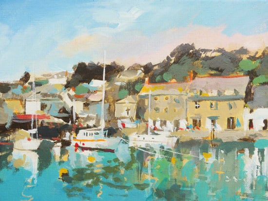
Having the reds and yellows in the middle ground add interest to the main focus of the painting and keep the strong turquoise of the sea separate.
You can watch the full video tutorial (45min) below. Enjoy!
How to paint a Cornish Harbour in Acrylics
You Might Also Like:
1. Painting, Pasties & Padstow – A Cornish Painting Trip
2. Painting Fishing Boats in St Ives
3. Capturing Winter Light in Cornwall

