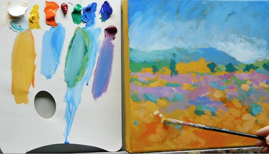
A step-by-step Impressionist Acrylic Painting – Part 2
In this painterly, impressionistic landscape series, I am posting a weekly video on my YouTube channel so that you can follow along at home.
It’s free to subscribe to the blog to receive updates so you can keep up with the painting progress…
How to paint like Monet – Free video Course |Part 2
This video below shows the next steps I take to build up this impressionistic landscape painting.
The next 6 steps
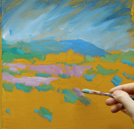
Step 1. Introducing Lilac
I mix a lilac using Cobalt Violet Hue and Titanium White. We are just blocking in the colours using short marks that leave some of the Yellow Ochre underpainting shining through, to get a feel for the colour harmony of the piece.
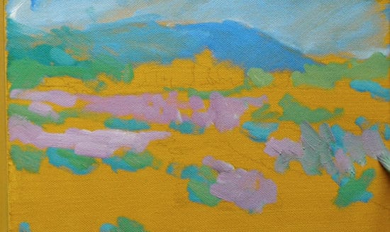
The double-loaded brush
If you notice, on my brush, each side has a different colour. I had dipped one side into the green mix and then twiddled the brush in my fingers to load up with some of the purple colours.
I can then paint a more broken colour effect very easily without going back to the palette. This produces a lovely muted tone with the acrylics, often more associated with Oils, as the colours mix in together ‘wet into wet’.
Pro tip: This technique can be very useful when depicting waves on a seascape when using a flat brush. Load up one edge with a white and the other edge with whichever blue you are painting with. You can then create a mixture of colours just using one stroke of the brush.
Step 2. Adjusting the sky
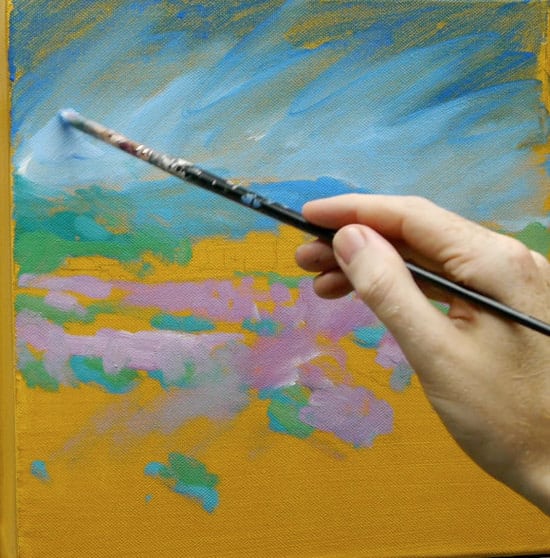
Now we have some of the foreground lilacs in the painting, it’s easier for me to judge how light or dark to go in the sky, so I can start to work with thicker paint to add some movement.
Don’t forget the reference photo is just a guide, don’t get too hung up if the shapes aren’t exactly right.
Check your corners
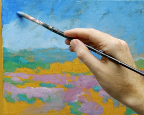
In landscape painting, the corners are very important. I often darken the corners to help bring the viewers eye back into the piece, particularly when the sky is very simple.
In this lesson, it helps to draw focus to the building in the middle of the painting.
In the next step, we can start to introduce darker tones to enhance the focal point.
Step 3. Mixing the darker green
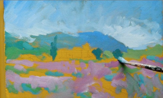
Using a mix of the Permanent Green Light and the Ultramarine Blue (the darker of the two blues we’re using) I can create a mix similar to Viridian Monet used on his palette. Another alternative green is Phthalo Green which is very close in tone to Viridian.
Notice how the dark green shapes surround the building; this contrast will help later on in the painting.
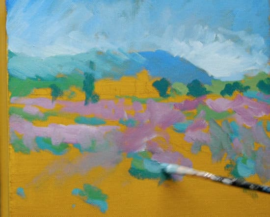
I then start to apply thicker paint than before and correct some of the drawing on the mountain.
I mix a turquoise using the Permanent Green Light and the Cobalt Blue.
When this colour is mixed, I scan the reference image for any examples of this colour appearing in the piece’s foreground. This helps to unify the painting and give a movement of colours throughout the painting. I use short strokes to apply the paint slightly more impasto (thicker) than the initial wash in. These dabs of colour help move the viewer’s eye around the painting; I add white to the mixture to vary the tints slightly.
Step 4. Introducing warm colours into the foreground
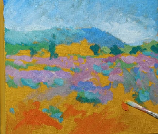
Using a watery mix of the Cadmium Red Light and the Cadmium Yellow Medium, I mix an orange that I can block in to create a strongly coloured undertone for the lighter, more impasto brush marks that come next.
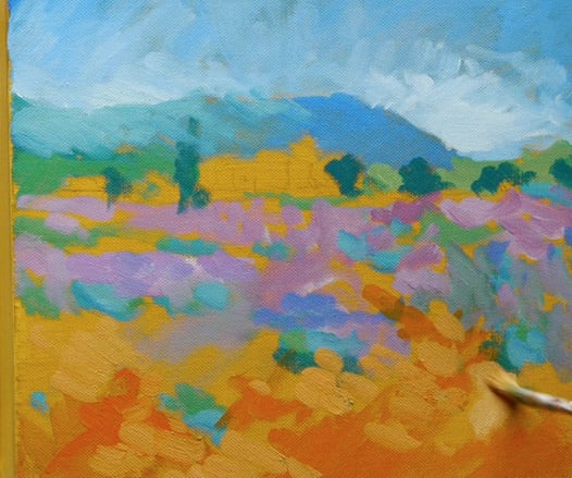
I then use the same optical mixing principle using broken colours, by dabbing thicker, lighter, yellower paint on top.
This is the same technique as when we applied a coloured ground to start the painting.
The great thing about acrylics is you can apply theses little areas of intense colour to other parts of your paintings to add interest and contrast. You can see how Van Gogh used a similar technique here.
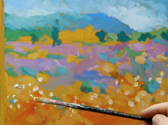
Using quite a thick paint on my brush, I then gently dab thick, white flecks of colour to give the impression of flower heads.
Step 5. Blocking in the building
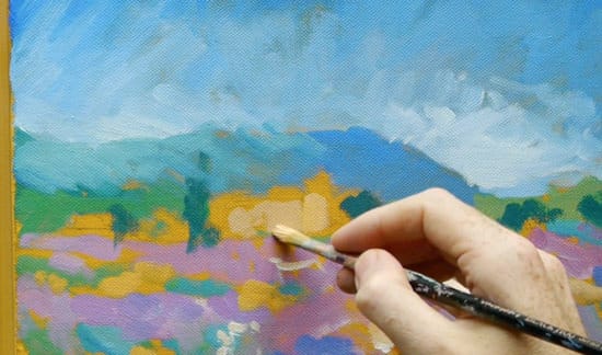
I mix a cream using the white, yellow and a touch of the Cadmium Red Light for the side of the building being hit by the sunshine.
For the shadow side of the building, I simply mix in a touch of the Cobalt Violet.
As purple is the complementary colour of yellow it helps to darken it down and produce a shadow that still has colour in it.
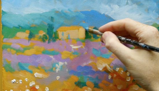
I then refine the building’s edges and add detail using a mix of Cobalt Blue and white.
Step 6.
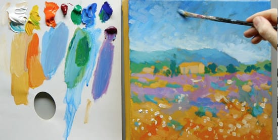
To finish off the sky, I mix in a bit of the Cobalt Violet to create a more muted blue, so it balances with the rest of the painting.
I also vary the direction of the brushstrokes to add interest.
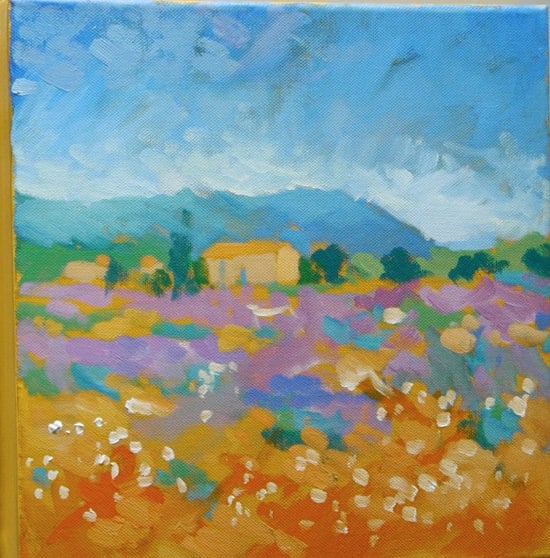
The impressionist painting at the end of Part 2.
Make sure to subscribe (it’s free) to keep updated; you’ll get email updates when the next video is posted.
Next week, for Part 3, we’ll start to add more details and complementary colours to bring it to more a finish.

