A step-by-step French Café Scene acrylic painting
In these tutorials I will be posting a series of videos on my YouTube channel that you can follow along at home. It’s free to subscribe to the website so you can keep updated with the painting progress.
You can watch Part 1 & 2 of the painting demonstration and Part 3 French cafe
This week we start to introduce a red and a yellow…
Materials you will need for this stage of the painting:
- 12mm Acrylic brush – Pro Arte Prolene – flat
- Size 4 Kolinsky sable from Rosemary & co – round – (any small round will be fine)
Paints
- Artist quality Titanium white
- Burnt Umber
- Phthalo Blue (Red shade) or (Green shade) – I demonstrate using Phthalo blue green shade
- Permanent Alizarin Crimson (Winsor & Newton Artists’ Acrylic)
- Naples Yellow (Winsor & Newton Artists’ Acrylic)
Other materials used
- Kitchen roll
- Jam jar for cleaning brush.
- Small dipper for diluting paint
- Stay-wet or tear off palette
- Palette knife – 45 RGM
Step 1. Introducing a Red
Having success with this method of painting, building it up slowly, is often a battle to resist the urge to go brighter and brighter too early on!
We’re going to creep up on our colours.
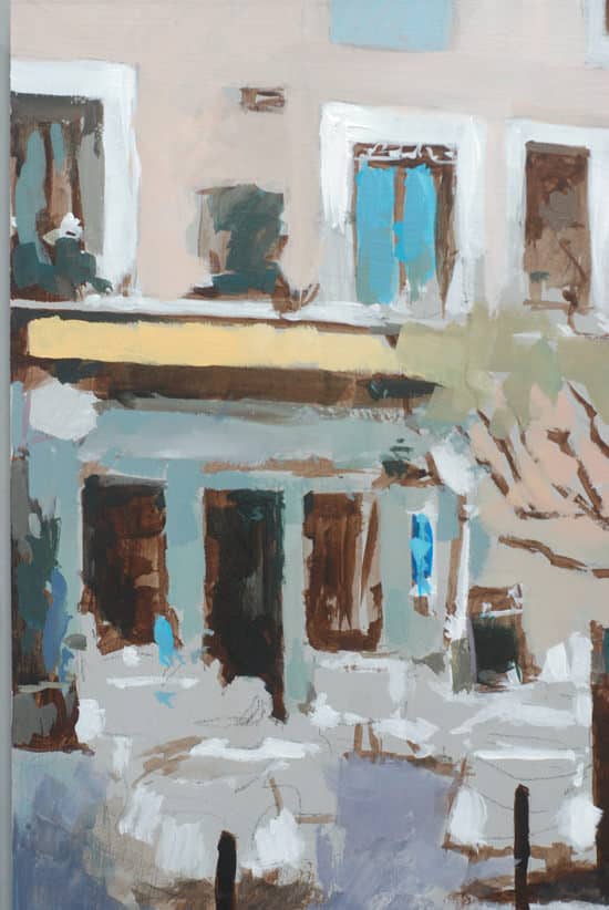
To wash in some of the purple/bluish tones to the left foreground, we’re going to need to introduce a red.
For this stage, I’m using a cool red – Permanent Alizarin Crimson.
The aim of colour mixing in a painting is to create the largest number of options from the minimum number of colours (whilst being able to mix the colour you want!).
Permanent Alizarin Crimson is a very handy colour to have in your paintbox (and one of the 5 I recommend for a basic beginners painting palette) as it can produce some lovely purples when mixed with Ultramarine blue and when mixed with Cadmium yellow light can make a nice warm red.
It has quite a dark masstone to it, and thus is often left on the artshop shelves, deemed ‘too dull’.
But Permanent Alizarin Crimson is a sleeping giant!
Wonders are hidden in this dark mass, just add white.
It has a nice translucent quality to it, so is very handy for thin glazing applications.
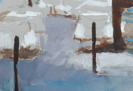
Notice how the purple colour can be blushed it quite watery at this stage. Having the toned ground gives us the luxury of painting thinly, yet the visual effect still being solid.
Consistency & Feel of the Paint
When you first start using Permanent Alizarin Crimson, it can feel quite ‘oily’ in comparison to other colours. This is because it can take quite a lot of milling in the manufacturing process to disperse the pigment evenly in the acrylic emulsion.
So what’s the difference between Permanent alizarin crimson vs traditional Alizarin crimson?
Permanent Alizarin Crimson vs Alizarin Crimson
- Alizarin crimson (colour index name either PR83, based on natural Madder pigment or colour index PR83:1 -synthetic laked pigment)
Traditional Alizarin Crimson has a notorious reputation for being a ‘fugitive’ pigment.
This is when the pigment loses its intensity and colour when exposed to light. Traditional Alizarin is one of the least lightfast colour’s still being produced.
You will find it mostly in watercolours as the acrylic version is called Alizarin crimson hue. The ‘hue’ denotes it is a modern replacement for traditional Alizarin crimson.
(Lightfast just means how quickly the colour would fade if exposed to light. This varies depending on what the colour is mixed with and the level of light exposure for the final piece. If the painting has been finished with an isolation coat it will have better UV protection than if left unprotected).
Paint manufacturers still produce it and it has a nice romance back to painters of old but it practical terms its just not that great. Even the American Society for Testing and Materials (ASTM) have commented:
“not sufficiently lightfast to be used in paints”
The pigments in the traditional Alizarin are a mix between Purpurin and Alizarin which is the natural dye found in the Madder plant.
Permanent Alizarin Crimson
Permanent Alizarin Crimson is a modern equivalent to the traditional Madder colour used in traditional Alizarin crimson. It’s a more stable synthetic man-made pigment that has similar colour properties, however, it can also mix brighter more intense colours than traditional Alizarin crimson or Alizarin crimson hue.
One of the most used modern pigments to create this crimson is the synthetic organic pigment Quinacridone (Colour Index Name: PV 19)
If you can’t get hold of Permanent Alizarin Crimson and want a close substitute, then add Quinacridone red to an Alizarin Crimson Hue.
The closest modern pigment to traditional Alizarin crimson is a colour such as Perylene Maroon, which is quite dark and excellent choice for making subtle shifts in skin tones.
Confused? In simple terms:
- Quinacridone Red is the most vibrant but most transparent
- Alizarin Crimson Hue is darker and more subtle (close to Perylene maroon)
- Permanent Alizarin Crimson is somewhere between the two
The Permanent Alizarin Crimson is a cross between Perylene maroon and a Quinacridone Red, so you can mix nice dark purples and brighter pinks.
If you have a look at this colour mixing comparison video below you can see the differences in intensity between the colours.
The video below shows the ranges of purples that can be made with a range of reds
Step 2. Introducing a Yellow
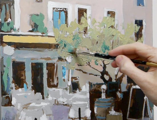
I’m using a Naples yellow at this stage. This is a lovely creamy, warm yellow that isn’t too bright. When mixing with the Phthalo Blue it will produce a muted green. If the greens go in too bright at this stage, they can put the balance of the painting out as we’ve used such subtle tones we’ve created.
Step 3. Using a Palette Knife
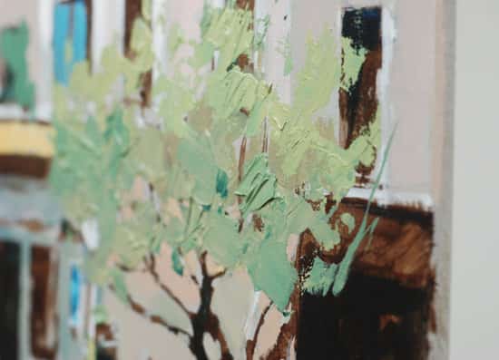
I use an angled palette knife to apply the green paint thickly onto the board. I draw into the paint with the palette knife as well as using the square ended brush for tweaking any area of the tree.
Pro tip: For more indepth palette knife painting techniques have a look at this tutorial.
French Café scene Acrylic painting – Free video Course |Part 4
Click the video below to watch the tutorial.
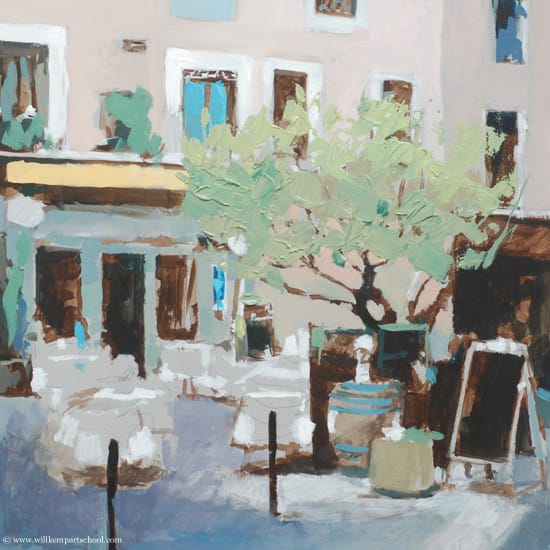
Here’s what the painting looks like at the end of Part 4
Tune in next week for the final part 5 when we introduce some brighter yellows & reds into the painting.
You might also like:
1. French Café Scene with Acrylics Tutorial – Part 1 & 2
2. French Café Scene with Acrylics Tutorial – Part 3
3. French Cafe Scene with Acrylics Tutorial – Part 5

